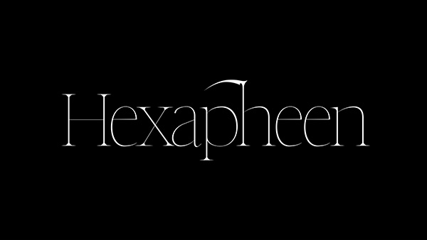
Hydropothecary

Defying popular culture
Due to legislative changes, the Canadian medical cannabis market has been opened up in recent years. Hydropothecary was a new voice in this brand new market, and needed an identity that would help it connect with a refined, affluent audience. This meant shifting away from the tropes typically associated with cannabis culture. No tie dye, no big obvious graphics of cannabis leaves, no 420 references and colours.

The flower
The graphic was inspired by the flower of a cannabis plant, instead of the more recognizable leaf. It’s worth noting that the flower is actually the most potent part of the plant, with the highest concentration of THC. This flower was used as the connector between the two stems of an H, making it easier to reference the brand name just by looking at the icon.

Applications
The application had to feel simple but luxurious. The icon can be used with or without the wordmark to create a striking brand presence on various applications.
Recognition & Credits
Agency: Jackpine
Want to see more?
Here are some similar projects to Hydropothecary relating to Branding.

Want to chat about a project
or just want to say hi?